Bringing crate digging online.
Vinyl Vault is a record shop for people who care which pressing they take home. I designed and built a custom Shopify storefront that makes room for both the search and the unexpected find.
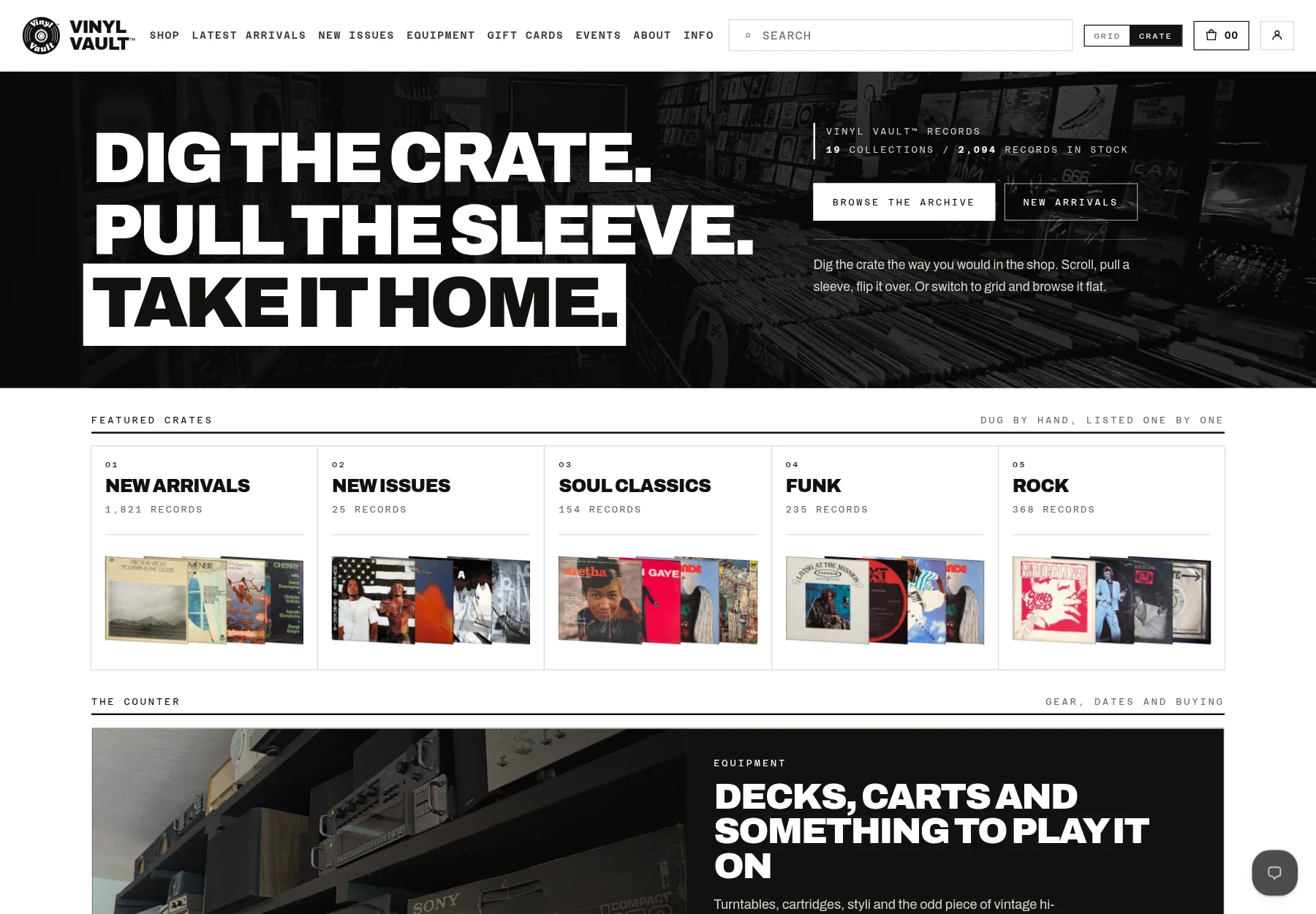
Business view: make room for discovery.
A record shop needs more than a wall of product cards. Some customers arrive with an artist in mind. Others want to spend time in a genre, follow an unfamiliar sleeve, and see what turns up.
The catalogue had 2,000+ records when observed during the project briefing, with stock changing over time. The challenge was to give that depth a clear structure without losing the pleasure of browsing it.
The archive offers named collections, new arrivals, and search. A visitor can start with a familiar category or head straight for a record, rather than work through one undifferentiated catalogue.
Dig slowly. Browse quickly. Your choice.
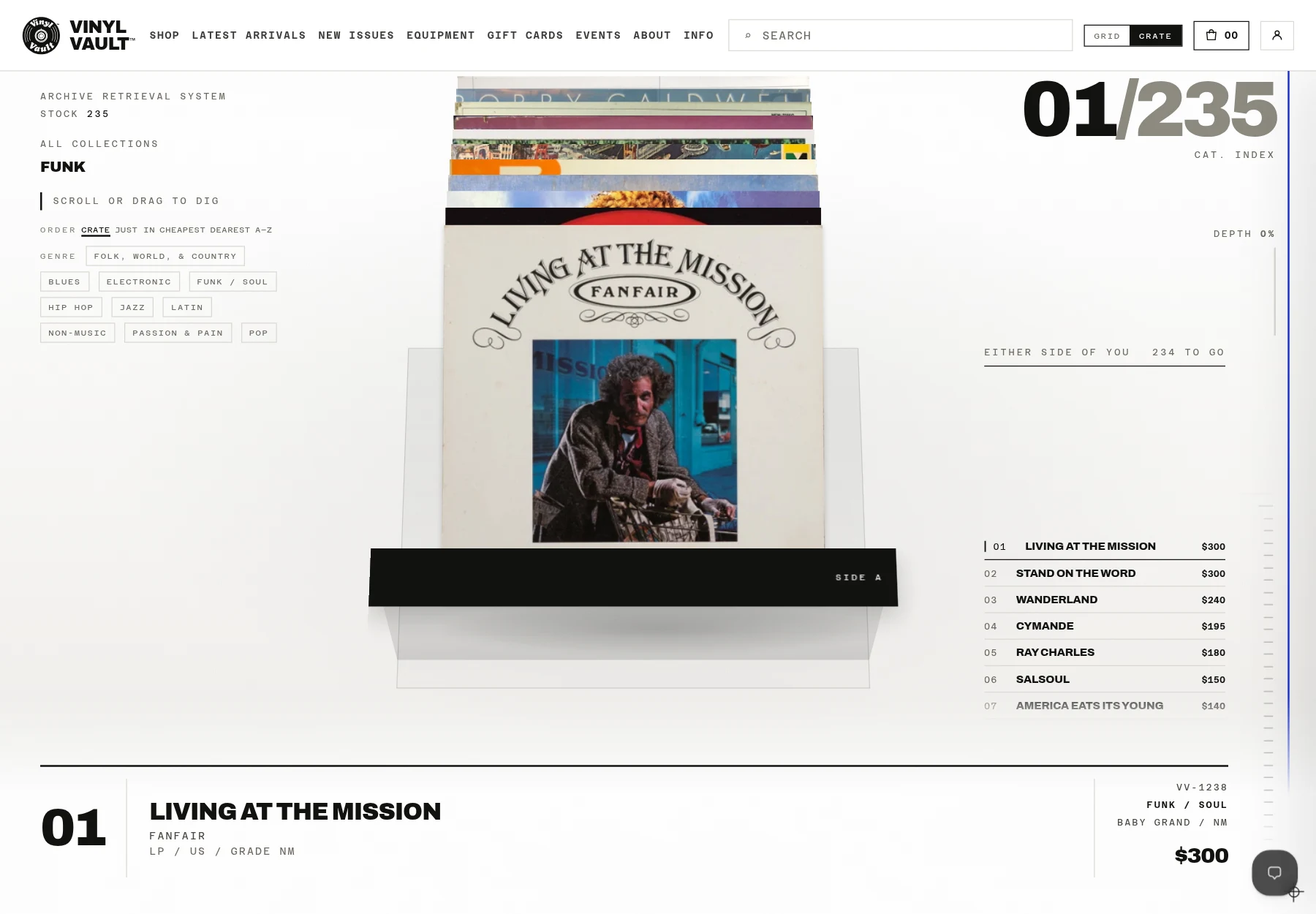
The custom crate is the shop's defining interaction. Sleeves sit behind one another, ready to scroll or drag through. Pull a record forward to inspect it, then turn the sleeve over. The interaction comes from the product and the way people shop for it.
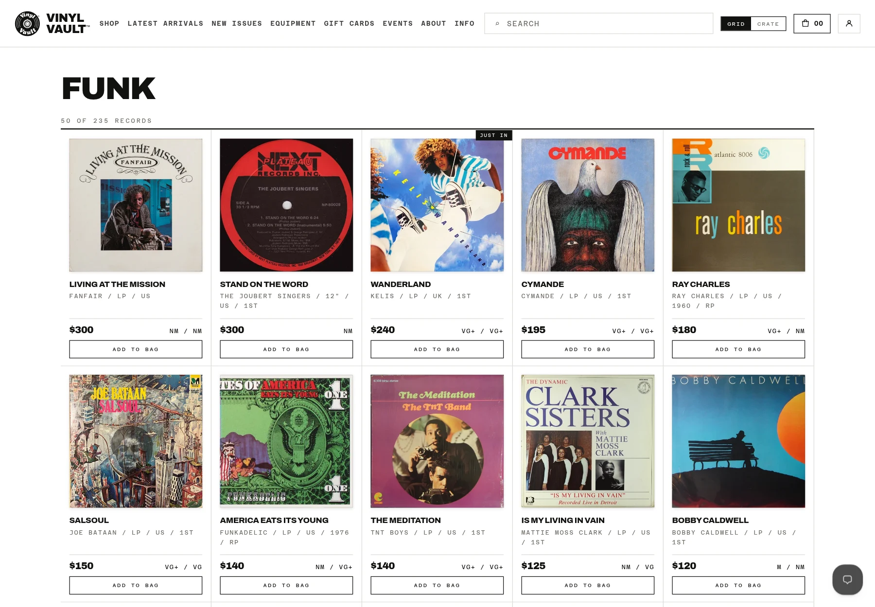
That is one way in, not the only way. Grid view presents covers, titles, prices, and grades together for a more direct comparison. The Grid / Crate control lets customers choose, and the site remembers their preference on that device.
The live site also provides keyboard instructions for the crate. Customers do not have to use a dragging gesture to explore the collection, and the conventional grid remains an explicit alternative.
Know the copy before you buy.
For a used record, the album title is only the beginning. Country, year, pressing, and condition help explain what is actually for sale. The storefront brings those details into the browsing and product experience instead of leaving the sleeve image to do all the work.
Media and sleeve grades are stated separately where they differ. The shop also explains that images from the Discogs release database represent the pressing, not the condition of the individual copy. The grade and listing notes tell that part of the story.
The distinctive front end sits on a practical commerce platform. Customers can add a record to their bag and continue to Shopify's checkout, while the catalogue and ordering remain connected to Shopify rather than becoming a separate demonstration.
The details behind the experience.
The business story is above. Open the implementation notes for the specific controls and platform choices visible in the live store.
Under the hood
A custom interface on Shopify
The storefront combines an archive, search, product details, and a shopping bag with the custom crate interaction. The live page is served through Shopify and loads its own crate stylesheet and JavaScript. Payment is handled by Shopify's checkout.
This keeps the unusual part of the experience where it belongs: in how customers explore the records, not in a replacement payment system.
More than one input path
The crate's published instructions describe Up and Down arrows to browse, Enter or Space to pull out a record, Enter again to turn it over, and Escape to put it back. The crate has a focusable, named region with those instructions attached.
The Grid and Crate controls are buttons with an exposed pressed state. The site also publishes reduced-motion guidance and offers grid browsing without the three-dimensional interaction. These are specific implementation details, not a claim of comprehensive accessibility certification.
- Catalogue structure
- Collections, new arrivals, search, and individual record listings.
- Browsing choice
- Crate or grid, with a preference remembered on the customer's device.
- Product clarity
- Pressing information, media and sleeve grades, and copy-specific notes.
- Commerce boundary
- A custom storefront connected to Shopify, with payment handled by Shopify.
What should your website make possible?
Tell me how your business works and where the current website gets in the way.
Start a project